Risk Atoms: A Bold Display Font for Digital Branding
It started with a hero section that felt… safe. Too safe. I’d spent hours refining the layout for a boutique coaching site—clean spacing, thoughtful imagery, strong value proposition—but the headline just sat there, polite and unremarkable. That’s when I dropped Risk Atoms into the H1 tag and hit preview. The shift wasn’t subtle. It was immediate: confident, sculptural, quietly commanding. Not loud for loudness’ sake—but bold in the way a well-placed accent wall elevates an entire room.
What Makes Risk Atoms Stand Out on Screen
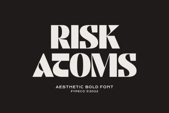
Risk Atoms is a premium display font—designed not for paragraphs, but for presence. Its characters have weight and intention: generous x-heights, open counters, and those distinctive geometric curves that feel both modern and grounded. Think of it as the typographic equivalent of a hand-thrown ceramic vase—crafted, intentional, full of quiet personality. It’s not a script font or a handwritten font; it’s a contemporary typeface built for impact at scale. In digital contexts, that means it thrives where attention needs to land: hero headlines, section dividers, CTA buttons, and brand name treatments.
Real Layout Testing: Where It Shines (and Where It Doesn’t)
I tested Risk Atoms across three real layouts: a course sales page, a portfolio homepage, and a small business blog header. On desktop, it performed beautifully—even at 64px, every character retained clarity without visual noise. Over light image banners? Crisp. Over dark gradients? Strong contrast held up, especially with subtle letter-spacing adjustments (+20–30 units worked best).
On mobile, I was cautious—and pleasantly surprised. At 48px on iOS Safari, it remained legible and stylistically intact. But I quickly learned its limits: it’s not for navigation menus, form labels, or body copy. Trying it at 16px for paragraph text felt like forcing a sculpture into a spreadsheet—it lost its soul and sacrificed readability. And while it’s PUA encoded (great for accessing alternates and ligatures), those flourishes are best reserved for hero text or decorative accents—not functional UI elements.
Here’s what worked consistently:
- Landing page headlines — Paired with Inter or Manrope for body text, it created instant hierarchy and brand distinction.
- CTA buttons — Even at 20px, “Start Your Journey” carried authority without shouting.
- Section headers in digital brand kits — Used alongside a simple serif (like Lora) for subheads, it gave editorial weight to otherwise flat templates.
- Logo lockups for digital-only brands — Especially effective when paired with a minimal icon or monogram.
Pairing It Right: Typography Harmony Matters
A display font like Risk Atoms doesn’t stand alone—it anchors. I found the cleanest, most professional pairings were with neutral sans serifs: Inter, Montserrat, or even system fonts like -apple-system for body copy and interface text. That contrast—sculptural vs. utilitarian—creates breathing room and guides the eye naturally. For more editorial or lifestyle sites, pairing it with a warm serif (like Playfair Display or Cormorant Garamond) added depth without competing.
Avoid stacking it with other display fonts or overly decorative scripts. It’s got presence—give it space to breathe. Also worth noting: check the included weights. My version came with Regular and Bold, which covered 95% of my use cases—but if you need Light or ExtraBold for fine-tuned hierarchy, verify before licensing.
Technical Notes Every Web Designer Should Check
Before dropping Risk Atoms into production, I verified four things:
- Webfont availability — Confirm the vendor provides WOFF2 files (smaller, faster-loading) and CSS @font-face kits—not just desktop OTF/TTF.
- Licensing for web use — Some “commercial fonts” cover only print or templates. Make sure your license explicitly includes website embedding, especially for client work or SaaS dashboards.
- Character coverage — Since it’s PUA encoded, test special characters, accented letters, and symbols in your target markets. I ran quick checks for French and Spanish diacritics—no issues.
- Performance impact — At ~45KB (WOFF2), it loaded fast, but I still applied font-display: swap to avoid invisible text during load.
Also: while it’s highly legible at larger sizes, avoid using it for small interactive elements like filter tags or pagination numbers. Its aesthetic strength lies in deliberate, spacious application—not density.
When to Reach for Risk Atoms—And When to Pause
Reach for Risk Atoms when you want to say, “This matters,” without saying a word. It’s ideal for:
- Hero sections on portfolio or creative agency sites
- Branded course or workshop landing pages
- Digital brand kits where visual identity must feel elevated and intentional
- Boutique online store banners (not product titles—those need scannability)
- Newsletter headers or campaign email subject lines (when rendered as web-safe fallbacks aren’t critical)
Pause before using it for:
- Mobile navigation bars or sticky headers
- Form fields, error messages, or accessibility-critical labels
- Long-form blog posts or documentation pages
- Dashboard interfaces where speed and clarity outweigh style
In the end, Risk Atoms isn’t just another display font—it’s a design decision with intention. It won’t fix weak content or poor UX, but in the right context, it adds polish, confidence, and a distinct voice to digital experiences that deserve to be seen—and remembered.